Candlestick Charts: Understanding Price Movements and Patterns
What are Candlestick Charts
Candlestick charts are a popular type of financial chart used to represent the price movement of an asset over a specific time period. They originated in Japan and have been widely adopted in technical analysis and trading.
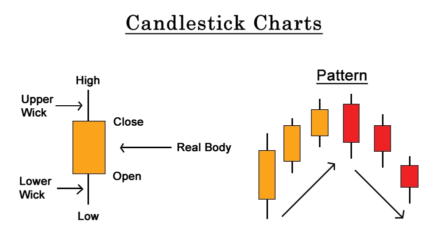
Candlestick charts display four essential pieces of information for each time period: the opening price, closing price, highest price (also known as the high), and lowest price (also known as the low). These data points are represented graphically using rectangular blocks called "candles."
Each candlestick has a body and sometimes has additional elements called shadows or wicks. The body of a candlestick represents the price range between where it started and where it ended. If the closing price is higher than the opening price, the body is usually filled or colored, typically green or white, indicating a bullish or positive price movement. When the closing price is lower than the opening price, the body of the candlestick is often left unfilled or colored in red or black. This suggests a bearish or negative price movement..
The shadows or wicks extend vertically from the top and bottom of the body, representing the high and low prices reached during the time period. The upper shadow extends from the top of the body to the high price, and the lower shadow extends from the bottom of the body to the low price.
Candlestick charts provide visual insights into the price action, allowing traders and analysts to identify patterns and trends. Various patterns, such as doji, hammer, shooting star, engulfing, and many others, can indicate potential market reversals or continuation of trends. Traders often use candlestick charts for Indian stocks in combination with other technical indicators and analysis methods to make informed trading decisions.

How to draw
First, draw a vertical line from the highest price of the
day to the lowest price. Next, draw a rectangle from Open to Close in the
vertical line above. If the Off value is greater than the on value, this
rectangle is shown in white, if the on value is greater than the black value.
This white line is called the "sunny line " and the black line is
called the "shadow line".
And this rectangle is called the "real body".
The line between the high and the high of the day is called the upper shadow,
and the line between the lowest point and the low of the day is called the low
shadow. This shade is sometimes called "beard". Since the main
movement is the opening and closing movement, this movement is boldly made as a
real body and the shadow is drawn as a line as it is an additional movement
that will affect the overshoot of the setting.
How to use
Candlesticks tell us everything. For example, the length of the actual body tells us the strength of buying and selling power. When the buyer is strong, keep buying, free space will be longer, and when the seller Product is strong, keep selling, and the black area will be longer.
To use candlestick charts effectively, follow these steps:
1. Understand the Basics: Familiarize yourself with the components of a candlestick, including the body, shadows, and colors. Learn how to interpret different patterns and what they might indicate about market sentiment.
2. Determine the Timeframe: Decide on the timeframe you want to analyze, such as daily, weekly, or intraday. Different timeframes provide varying levels of detail, so choose one that suits your trading or investing strategy.
3. Identify Trends: Look for trends in the chart by analyzing the sequence of candlesticks. Bullish trends consist of consecutive candles with rising prices, while bearish trends involve candles with declining prices.
4. Recognize Candlestick Patterns: Learn to identify common candlestick patterns, such as doji, hammer, engulfing, and more. analyse candlestick charts, These patterns can provide insights into potential market reversals or continuation of trends.
5. Combine with Other Indicators: Utilize candlestick charts in conjunction with other technical indicators, such as moving averages, oscillators, or volume indicators. This can enhance your analysis and provide confirmation or divergence signals.
6. Practice Risk Management: Implement proper risk management techniques, such as setting stop-loss orders or using position sizing, to protect your capital and minimize losses.
7. Backtest and Validate: Test your strategies and observations on historical data to assess their effectiveness, easy way to read candlestick charts. This can help you refine your approach and gain confidence in your trading decisions.
8. Stay Informed: Keep up with market news, economic events, and other factors that might impact the price movement. The fundamental analysis combined with candlestick patterns can provide a comprehensive view of the market.
Long shadow
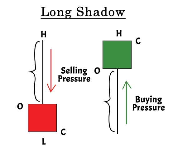
A long shadow in a candlestick chart refers to an extended vertical line or wick that protrudes above or below the body of the candlestick. It indicates that the price of the asset moved significantly higher or lower than the opening or closing price during the time period being analyzed.
When a candlestick has a long upper shadow, it suggests that the price reached a high level but faced selling pressure, resulting in a reversal or pullback from those highs. This can indicate potential resistance levels or a bearish sentiment in the market.
On the other hand, a long lower shadow indicates that the price dropped significantly but encountered buying pressure, causing a rebound or recovery from those lows. This can signal support levels or a bullish sentiment in the market.
The length of the shadow relative to the body of the long shadow candlestick pattern provides insight into the strength of the price movement, a candle with long shadow. A longer shadow indicates a more significant price rejection or reversal, while a shorter shadow suggests a milder reaction.
Traders and analysts often pay attention to long shadows as they can indicate potential trend reversals or support/resistance levels. However, it's important to consider other factors and confirmations before making trading decisions solely based on long shadows.

Conclusion
In short, the candlestick charts are a visual representation of price movements, with vertical lines indicating the highest and lowest prices, and rectangles representing the opening and closing prices. They help identify trends, patterns, and potential market reversals. candlestick shadow analysis long shadows indicate significant price rejections beyond the opening or closing prices. However, it's important to use candlestick charts alongside other analysis tools and stay informed to make informed trading decisions.
0 comments